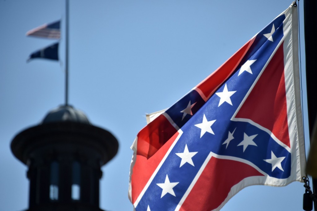
The tragically renewed controversy this week regarding the Confederate battle flag that flies outside the South Carolina state capitol offers an important lesson about the power of logos. That’s because flags are ultimately logos writ large across the history of the states and countries they represent.
What makes a flag such a powerful logo? At least three things:
Frequency. As every professional communicator knows, visual identity thrives on repetition. A state or national flag is ubiquitous in its visibility. Over its decades, or even centuries, of history, a flag is seen by millions of people, collectively constituting billions of impressions.
Consistency. Flags, once designed—and every flag has a fascinating design history—possess an enduring quality. Nations don’t change their flags every year or two to create a more relevant, updated look that Millennials will think is cool.
Emotional Associations. Flags are repeatedly associated with highly emotional events in a nation’s collective psyche. Take the American flag for example. An art student today would get a D- for designing the U.S. flag based on its ungainly, off balance design, dated colors and unnecessary complexity. It violates nearly every rule of good design.
Yet its emotional power is beyond measure. When you picture the flag raised over Iwo Jima or the rubble of the World Trade Center, or draped over a coffin, its symbolic power is incalculable. It’s why you get that lump in your throat at a ball game while you gaze at the flag during the national anthem.
So here’s the big lesson for logo designers: A logo is as much about the emotional associations it can absorb over time, as it is about the initial impression it projects.
I’ve helped design a lot of logos over the years. They were all part of corporate identity packages used to brand or re-brand an organization. The process always becomes one of introspection for the client as they seek to distill the essence of their organization into a single visual symbol. But the focus is almost always on what the logo can project.
But there is an equally important factor to consider:
How effectively will the logo be able to absorb the organization’s future shared experiences and emotions of customers, employees and partners, even years down the road?
Like a solar cell soaking up the sun’s energy, a good logo will be able to accrue increased brand equity over time. Of course you’ll never know if a logo can handle the load until several years have passed. That’s why you don’t change it every couple of years, and why you put a lot of thought into it.
And while there are good design principles that must be followed when creating a new logo, it also takes that sixth sense—that intuition—to be able to look at a new logo, and be able to say, “Yeah, this one can go the distance.” It’s that same instinct that might also tell you, “On further reflection, our current logo doesn’t need to change. It’s doing its job quite well.”
Perhaps one day, designers will be able to time travel to the future and see how effectively their logo designs served their clients.
Until then, we’ll all have to ask ourselves if a new logo design can absorb brand equity tomorrow as effectively as it projects brand identity today.