I just went to Italy with my wife for our 30th wedding anniversary. As a former art student and lover of art history, this was the trip of a lifetime. We saw much of the world’s greatest art throughout Rome and Florence.
“Wow” was often the only word we could muster.
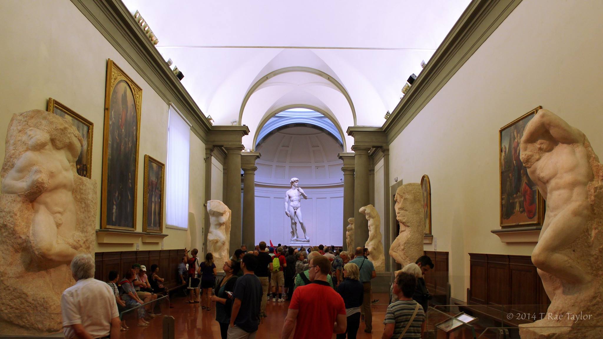
Michelangelo’s “David” was everything I hoped…the “Sacrifice of Isaac” by Caravaggio was, well, a masterpiece…and “The Birth of Venus” by Botticelli made my heart leap. But my favorite may have been the angel statues on a bridge over the Tiber River. You don’t see that in Boulder.
We were told 15,000 to 20,000 people go through the Vatican museum everyday. Imagine you and a thousand sweaty tourists tightly packed together, moving in and out of crowded corridors, stairwells and hallways, jostling with cameras to get a pic of one jaw-dropping work after another.
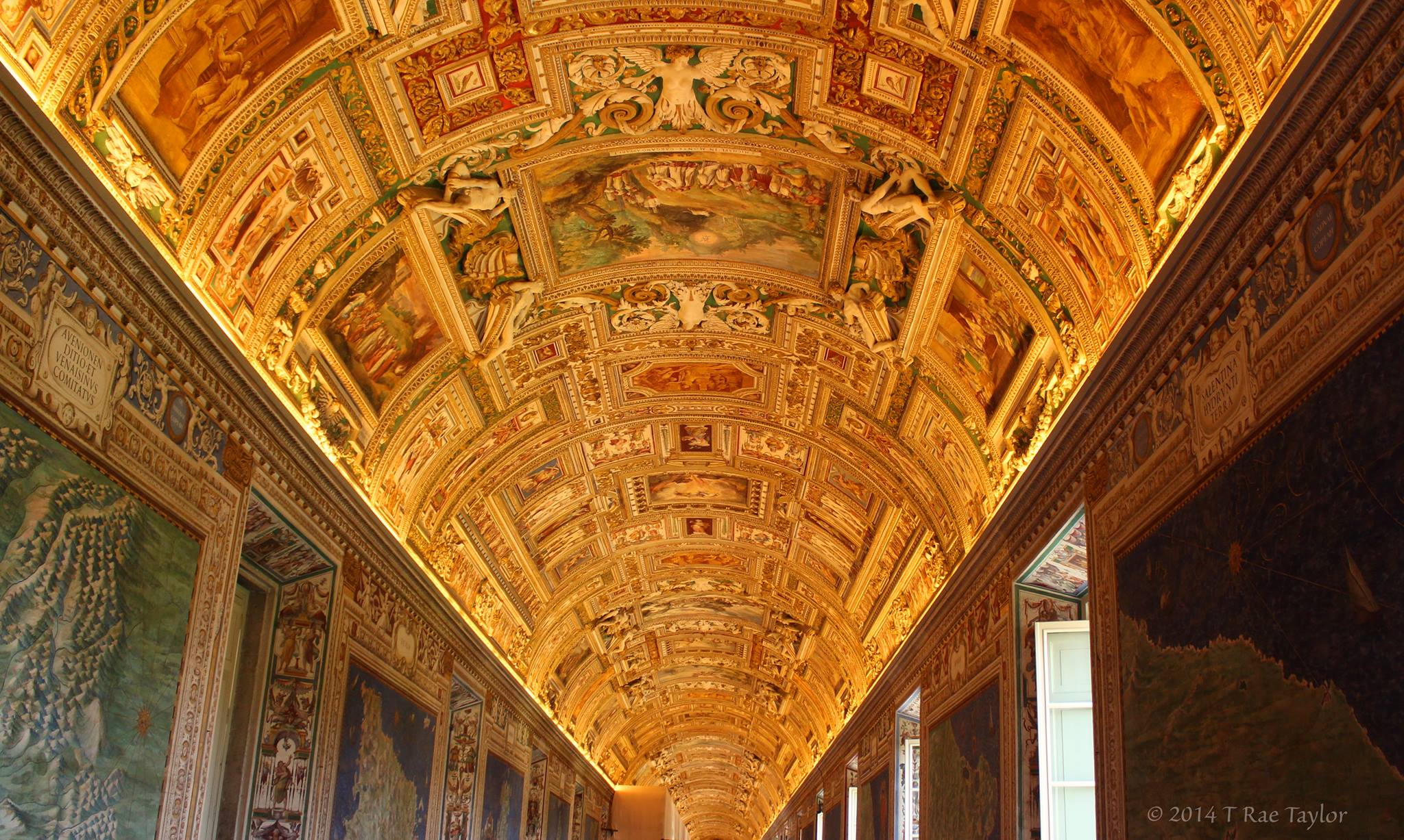
Busy and clutter gets lost like this hall that went on for a hundred yards.
After a while, we found ourselves walking through various rooms where virtually every square inch of space—walls, ceilings, doors and floors were covered with art. It was too much. It was a blur. And it was too bad. Truth be told…when we finally arrived in the much heralded Sistine Chapel, we were mentally exhausted and ready to go back to our hotel.
It was like drinking art from a fire hydrant.
Those galleries could take a few tips from modern marketers.
You can do more with less. Consider design hierarchy. Take advantage of focal points. Use restraint. In other words, put only one major work on a wall, or place only one statue in a room. They did it marvelously with “The David” and it was the best-received, most talked-about art in Italy.
Simple, focused and focal points tend to drawn you in…and win.
Good designers know this, as do good marketers. It’s so easy to over design. Like good writing, it’s harder to write less. It takes skill and talent to craft a masterpiece. Busy is bad. Simple, easy, and meaningful is good. And if it’s memorable, it’ll pack quite a punch.
If I could survey the throngs of thousands who saw the countless works in crowded spaces, I know they would only remember…a few. Those would be the ones that were presented in a way that people could absorb them without all the distractions.
Like “The David.” And just like that sculpture commemorated “good triumphing over evil,” good design and branding triumphs over bad. Think Apple. It stands out consistently because of its intentional space and simplicity.
When good stands out in a busy and crowded world of images and messages, it wins.
“An intellectual says a simple thing in a hard way. An artist says a hard thing in a simple way.”
– Charles Bukowski